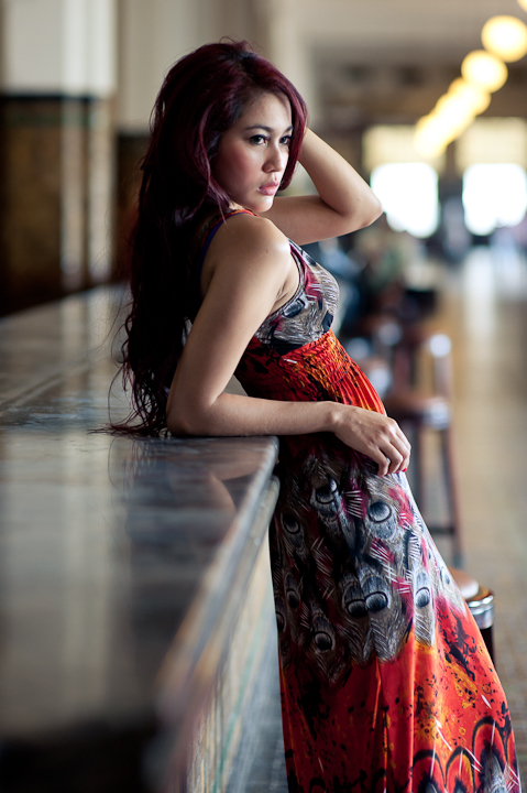
During the workshop I held a portrait photo model, a question that often arises is how to get a good composition. For beginners, there are some rules that can help, such as one-third rule (rule of thirds), patterns, shapes, frames / frame, perspective and others.
This time I will give you some tips on how to make the composition better by avoiding common mistakes. One of the mistakes that I often come across is the space above the head too much.
# 1 When the area at the top of the head model is to support and establish the atmosphere of an image, then it is okay. But if not, should not have to leave most of the space above the head model.
# 2 For a photographer who was a tall, do not forget to align the lens in accordance with the high model with slightly bent knees. When you are in the photo is a close-up photos (photos head and shoulders only) then align it with the nose, when the composition is 1 / 2 body, align with the chest, when the composition of the body, align the waist. If not aligned, then the model will look shorter than it is. Conversely, if too low, the model will appear higher and the lower body model (legs, hips) will look bigger.
# 3 It is very important another background is concerned. Do not just focused on the model alone, but also note his background. Very often there is something in the background that disturb, such as electricity poles, cables, others are ongoing, and so on. If the background is distracting and lure people's attention, you should choose another angle or move the location.
# 4 Lighting is important in the composition of the photo, avoiding frontal light that shines directly into the face of the model, because the illumination from the front will make the face and two-dimensional images look, place the model or the light source slightly laterally so that the shadows that fell into the face to form a visible three-dimensional face . source: infofotografi.com


No comments:
Post a Comment